ARIAT / CART + CHECKOUT EXPERIENCE
Making the last mile of shopping easier to finish.
The cart and checkout were asking people to work too hard at the moment they were ready to buy. I set the consolidation and clarity vision, used funnel evidence to focus the work, and coached the detailed design through a production launch that matched our proposal.
DESIGN FILE / MOBILE EXPERIENCE
One purchase path, with the next decision always in view.
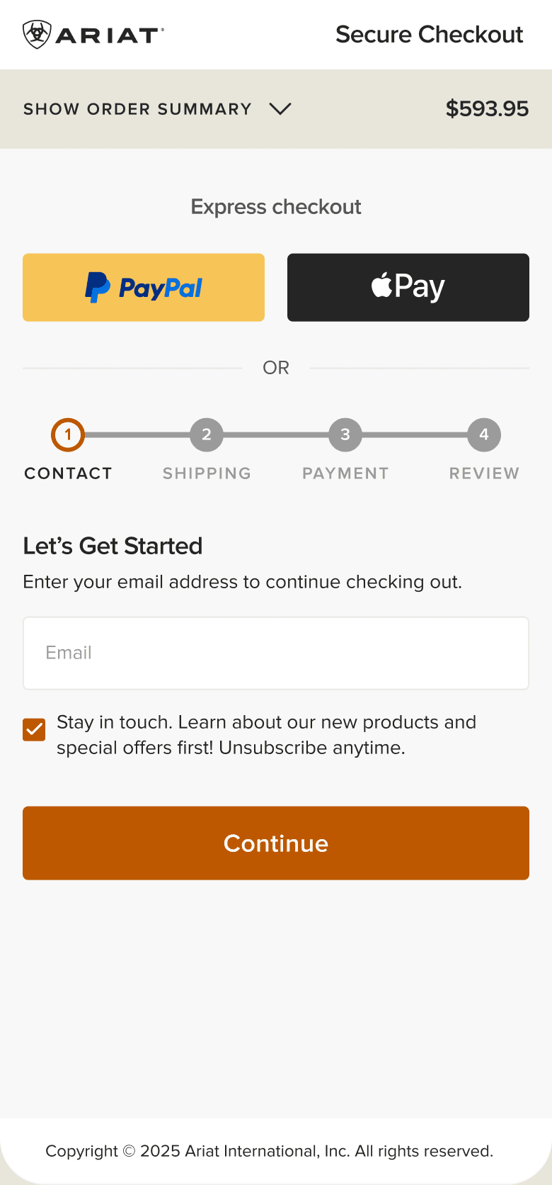
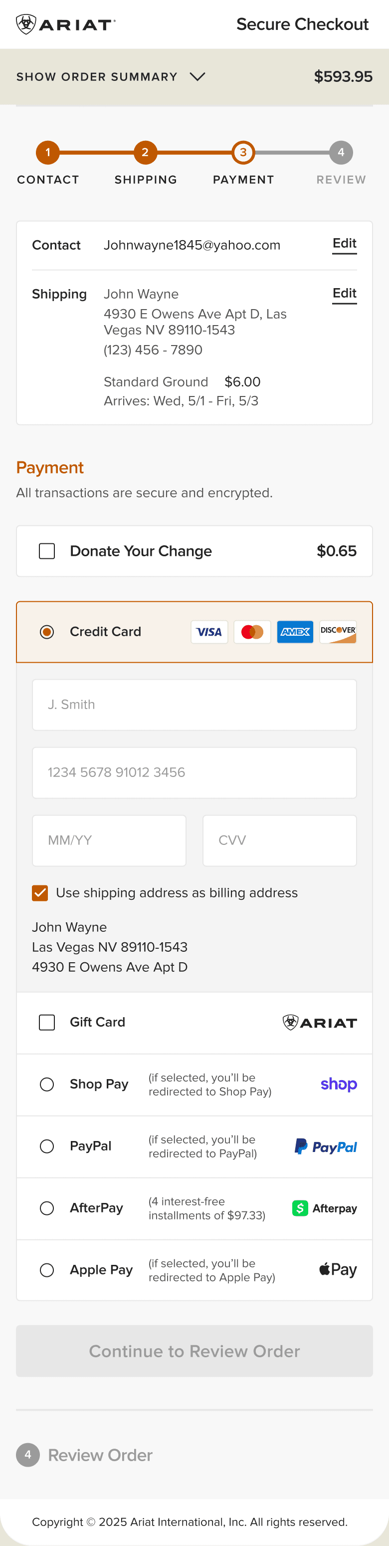
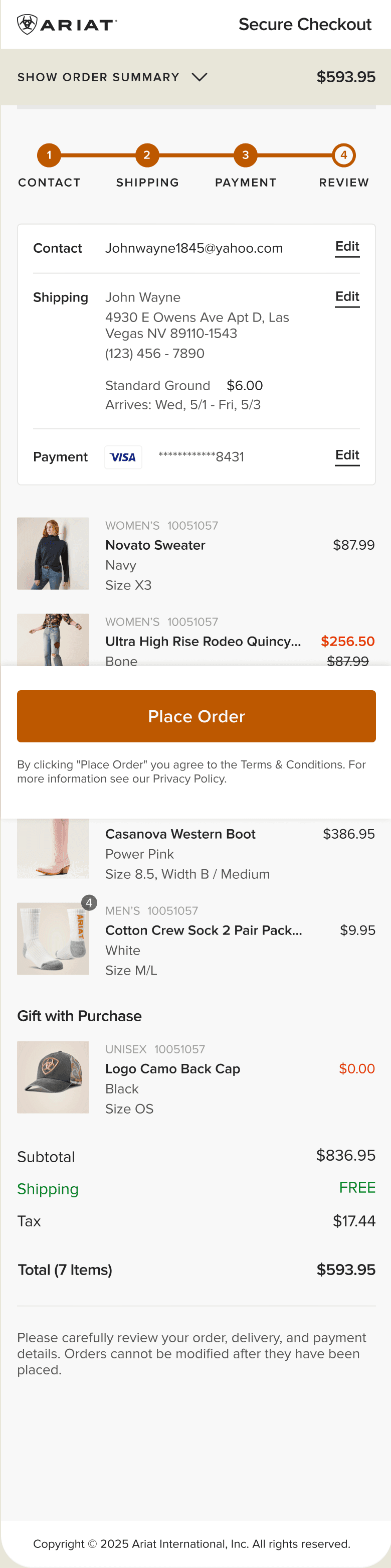
Express checkout, a visible four-step model, editable summaries, and familiar payment choices made a complicated flow easier to understand. These Figma frames include later iterations; they are not a record of every feature in the 2024 launch.
01 / FIND THE FRICTION
The data showed where confidence was breaking down.
This was a UX-led initiative grounded in our own funnel behavior, click patterns, and competitive research.
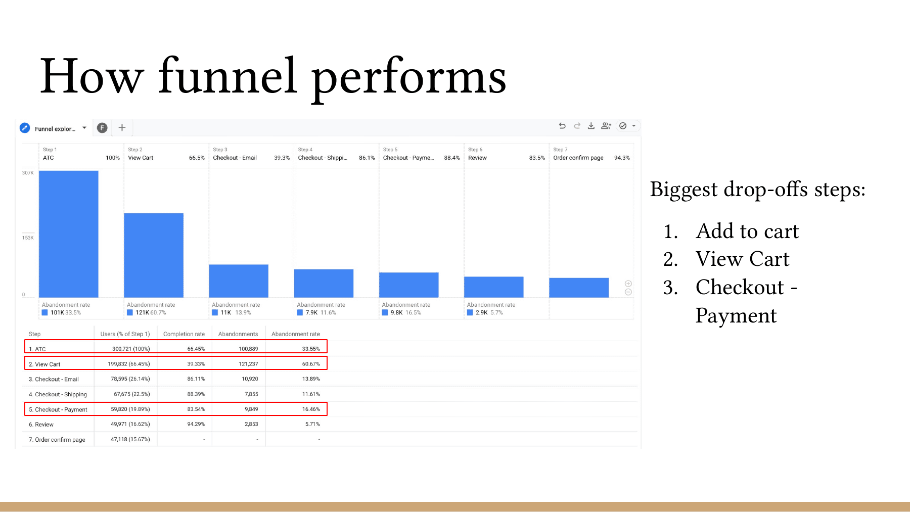
The largest losses appeared when people added a product, entered the cart, and reached payment. Returning shoppers converted better after adding to cart, which suggested that familiarity helped. The experience needed to give new and returning customers that same sense of orientation.
- 01
ADD TO CART
The first major break in the purchase funnel.
- 02
VIEW CART
A dense decision point with too many competing actions.
- 03
PAYMENT
The largest lower-funnel opportunity across devices.
02 / FROM SIGNAL TO SYSTEM
Shorten the path without hiding what people need to decide.
The redesign did not remove detail for the sake of looking clean. It gave each decision a place, kept the order visible, and let guest and member journeys follow the same understandable structure.
- 01SIGNAL
Lower-funnel friction was structural.
The cart competed with checkout, payment carried too much cognitive load, and device behavior exposed different weak points.
- 02DECISION
Create one guided purchase path.
Use a visible sequence, persistent order context, address autofill, and a clear primary action at every stage.
- 03SYSTEM
Design the model across real states.
Guest, signed-in, account creation, merged-cart, mobile, desktop, and international flows all had to hold together.
03 / CONSOLIDATE THE EXPERIENCE
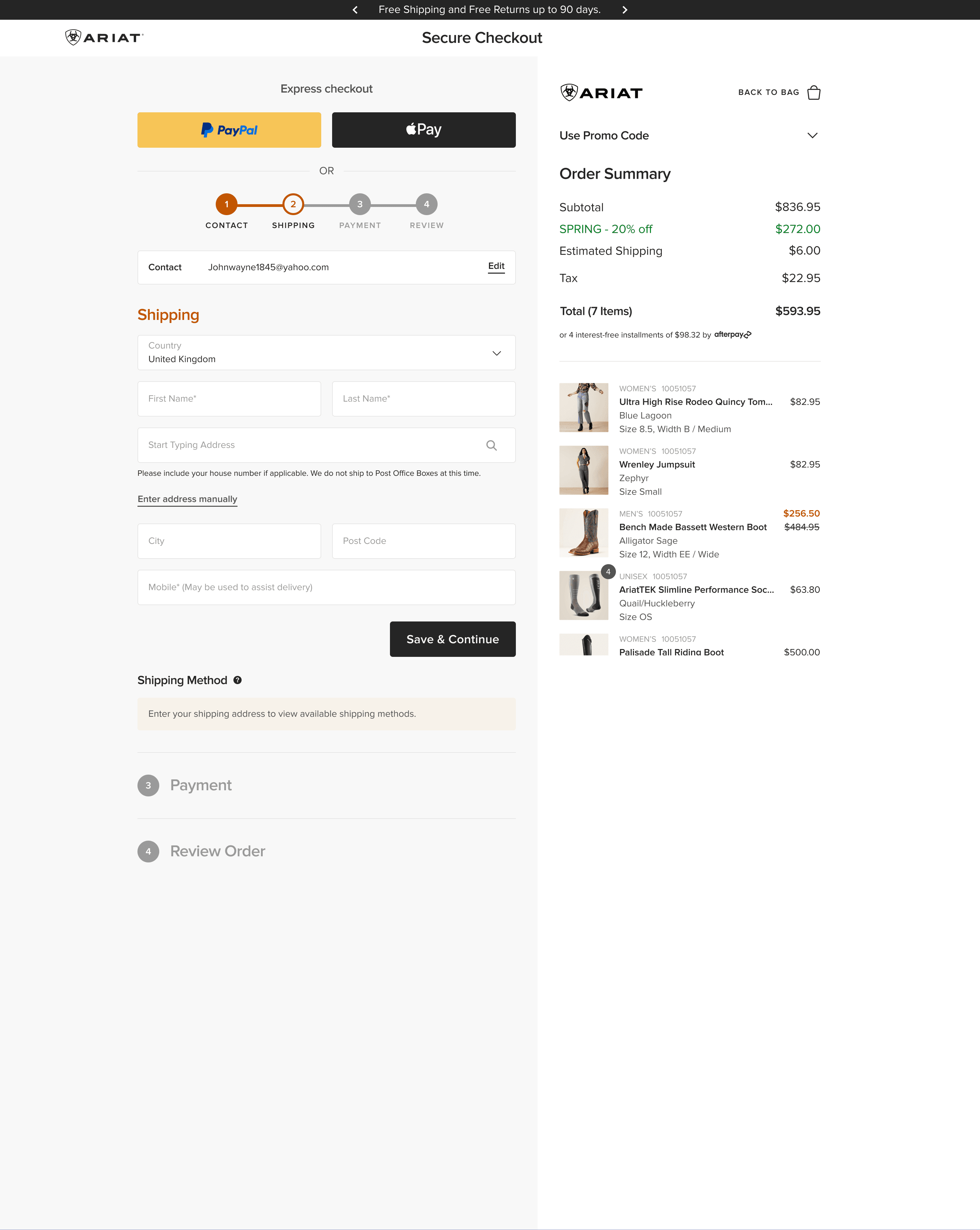
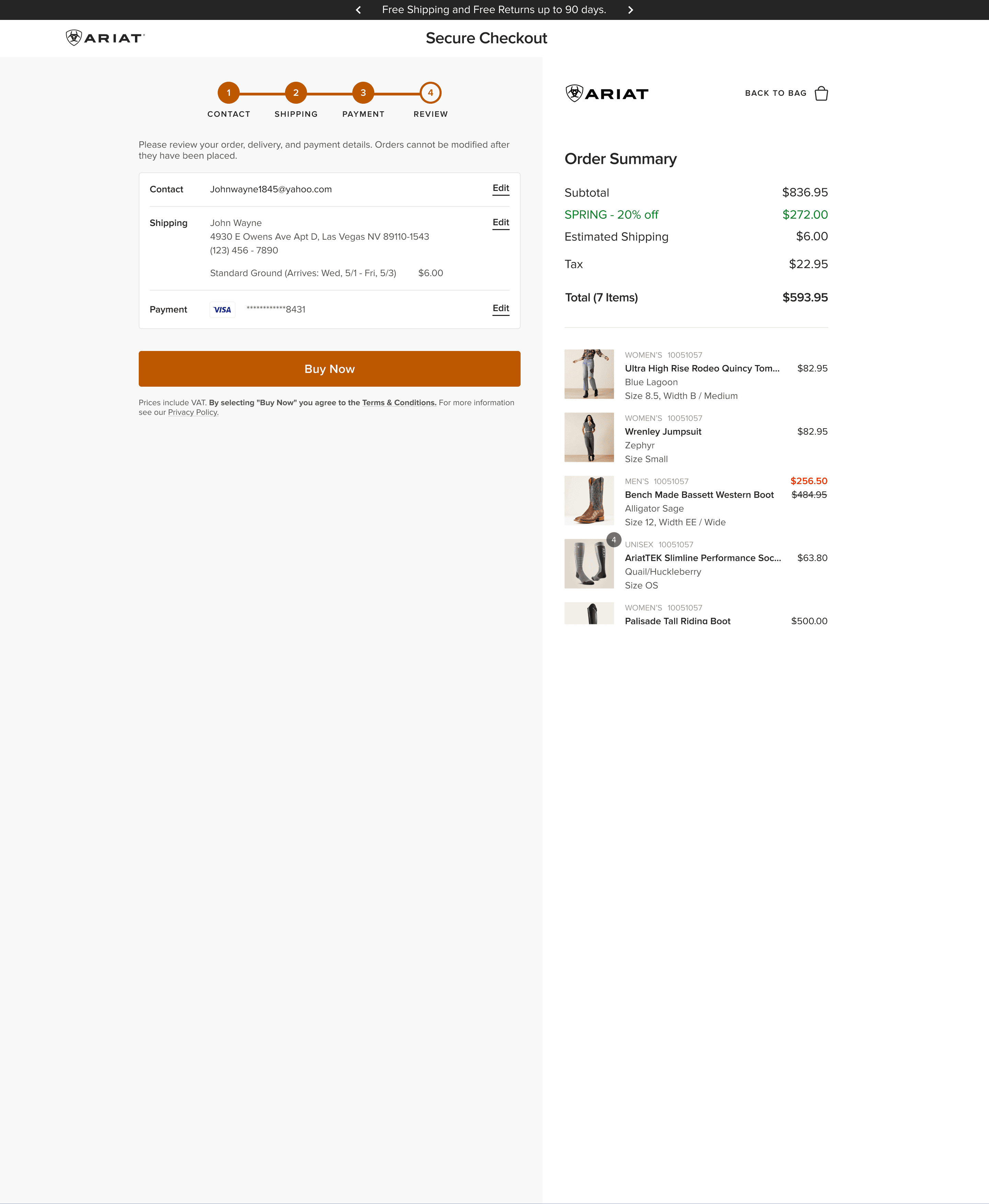
Desktop became a working surface, not a stretched mobile flow.
The main task stays on the left. The order stays visible on the right.
That structure reduced context switching and gave edits, totals, products, discounts, and payment information a stable hierarchy. It also gave the system room to support guest, signed-in, and international variants without reinventing the page.
04 / USE THE MOMENT WELL
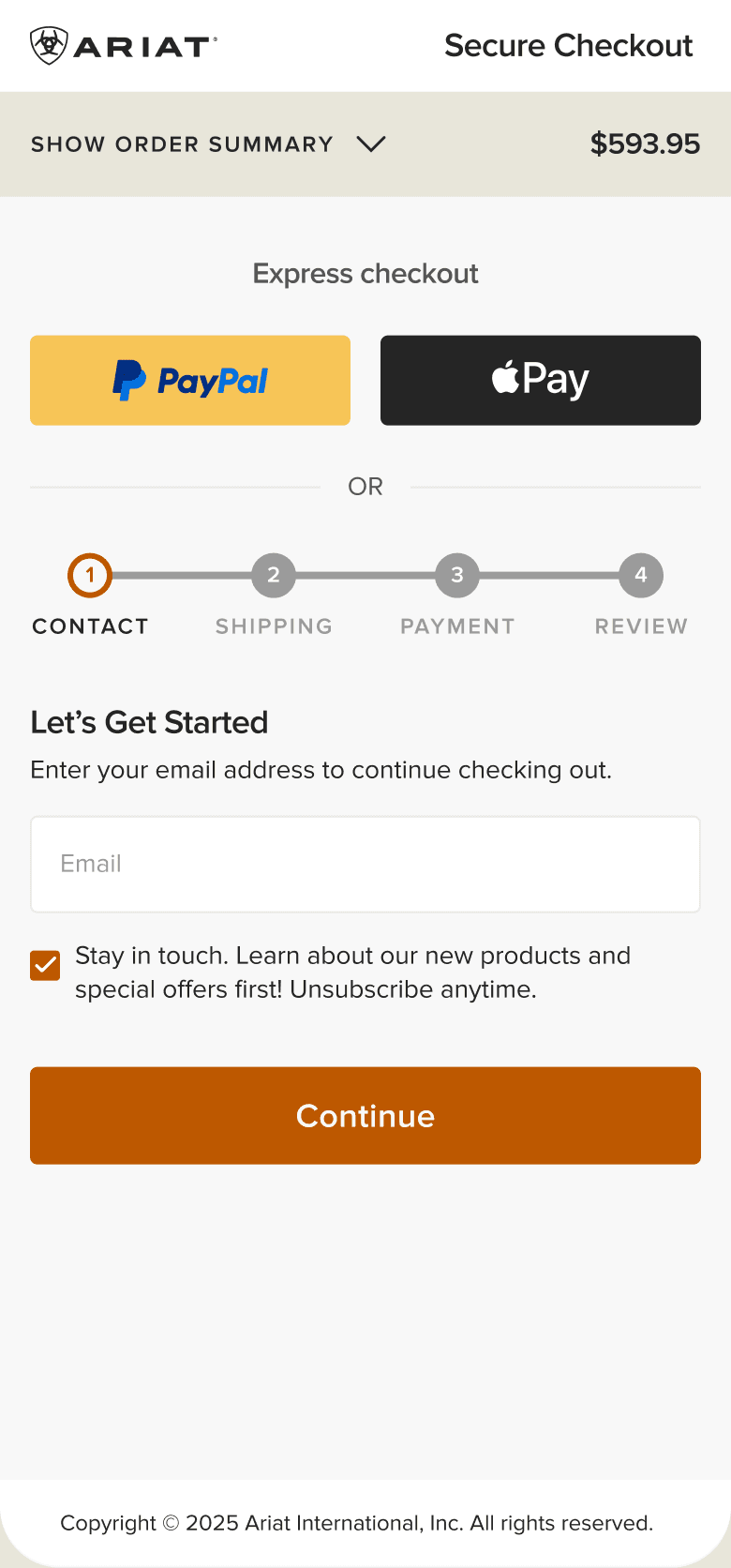
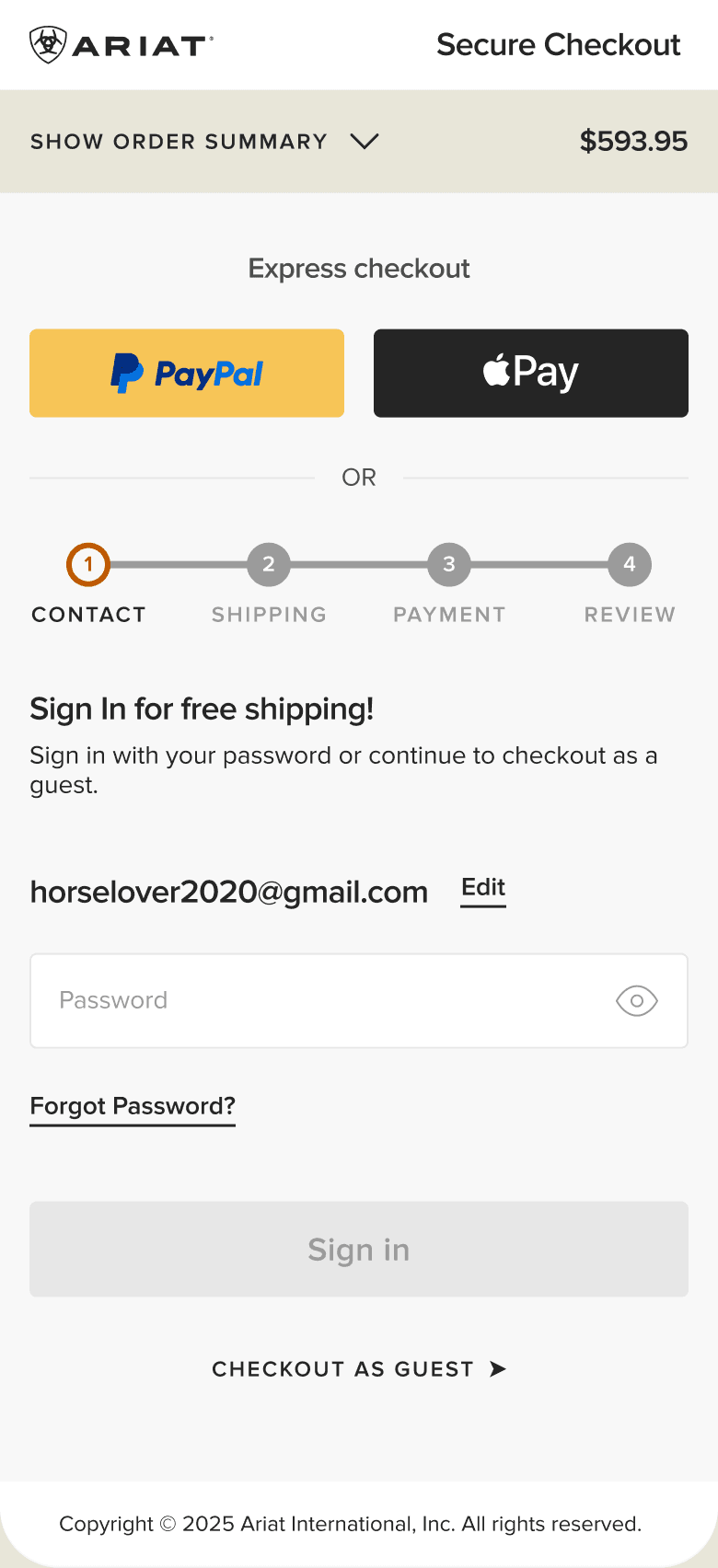
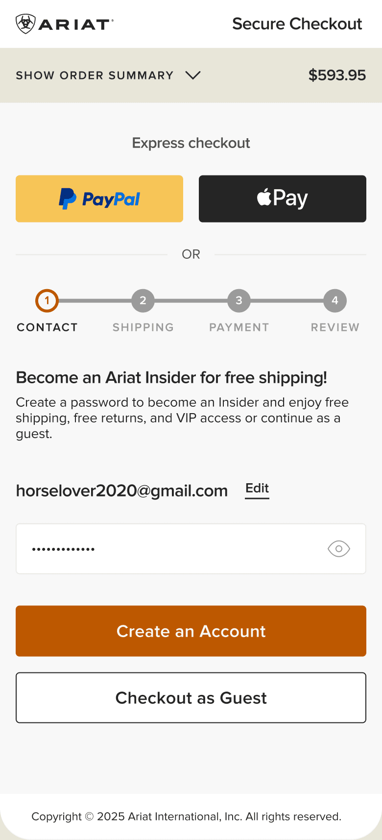
Account choice became guidance, not a toll booth.
We designed a clearer entry for guests and existing members while keeping Ariat Insider visible. People could continue without an account, sign in when it was useful, or create one without being sent away from checkout.
The goal was practical: support conversion first, then make the value of membership understandable inside the journey.
05 / HOW I LED IT
I gave the team a clear target, then stayed close enough to protect it.
A product designer on my team owned the detailed execution. I set the vision, brought the evidence into the work, coached the design, and helped the team resolve decisions across UX, loyalty, analytics, and technical feasibility.
I set the experience direction.
I pushed for one clearer path through My Bag and checkout, with a visible step system, a stable order summary, and less competition around the primary action.
I coached the work without disappearing from it.
A product designer on my team carried the detailed execution. I stayed close to the responsive UI, helped solve the hard states, and protected the quality bar through delivery.
I negotiated what the first release could support.
We secured billing and shipping address autofill. We also advocated for estimated delivery dates, but technical constraints kept them out of the first release.
06 / OUTCOME
The proposed experience launched intact and moved conversion in the right direction.
The post-launch analysis estimated a +0.04% all-traffic conversion lift and a +0.09% lift in direct traffic. More customers moved into the lower funnel, with improvement concentrated around payment and review.
The launch also created the base for later work including Shop Pay, checkout error handling, loyalty refinements, and continued mobile improvements.
METHOD / YEAR-OVER-YEAR JULY–SEPTEMBER COMPARISON, WITH LISTED HOLIDAYS AND REPORTING INCIDENTS EXCLUDED. DIRECTIONAL ESTIMATE; NO STATISTICAL-SIGNIFICANCE CLAIM.