ARIAT.COM / SITEWIDE EXPERIENCE TRANSFORMATION
I established a new direction for Ariat.com, then helped it grow across the whole commerce experience.
I led the strategy and experience direction that earned approval from Ariat's CMO, Chief eCommerce Officer, Brand, and Creative leaders. I kept the work moving through workshops and new design cycles as the foundation expanded across the broader commerce experience.
THE EXPERIENCE IN PRACTICE
The visual refresh opened the door to a larger product transformation.
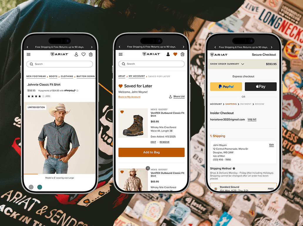
It created a clearer foundation for product teams to improve discovery, saved intent, merchandising, and purchase across the site.
01 / FIND THE REAL OPPORTUNITY
The homepage exposed a bigger experience problem.
Ariat had a strong brand and a growing global business, but the digital experience had accumulated different visual rules, competing priorities, and inconsistent ways to shop.
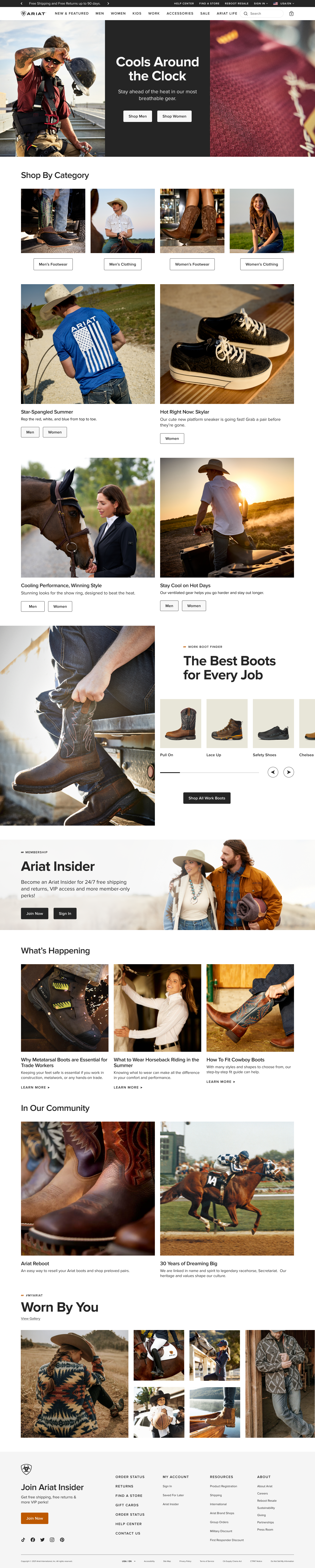
The homepage gave me a place to show what a more coherent Ariat.com could feel like. I proposed a visual and interaction direction that could work across mobile, desktop, marketing stories, product discovery, and conversion.
The presentation helped the CMO, Chief eCommerce Officer, Brand, and Creative leadership see the opportunity as a sitewide change. Their approval opened the gate for the broader work that followed.
02 / ESTABLISH THE DIRECTION
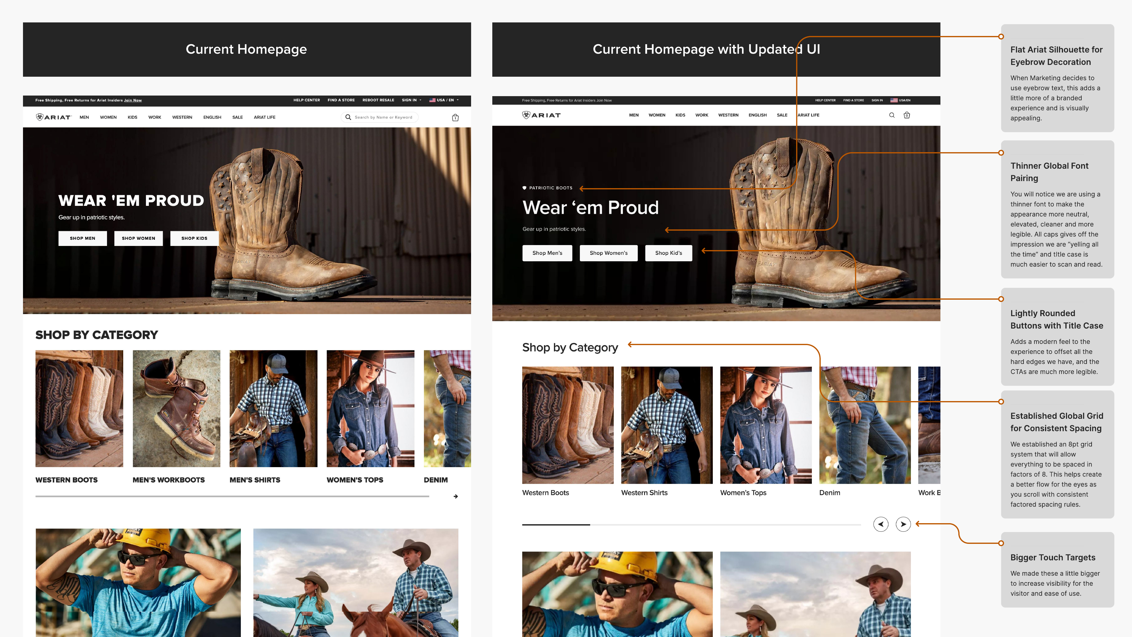
I made the larger change tangible through four shared interface rules.
The homepage proposal gave leaders something concrete to evaluate, then gave teams a common foundation for the surfaces that followed.
Calmer typography
A thinner global type pairing and less reliance on all caps improved scanning and gave the brand more range.
Consistent spacing
An 8-point grid brought repeatable rhythm to modules that had previously been composed one page at a time.
Clearer actions
Larger controls and clearer button treatments made important actions easier to see and use on mobile.
Flexible storytelling
Responsive image formats and modular layouts gave Marketing more expression without breaking the customer journey.
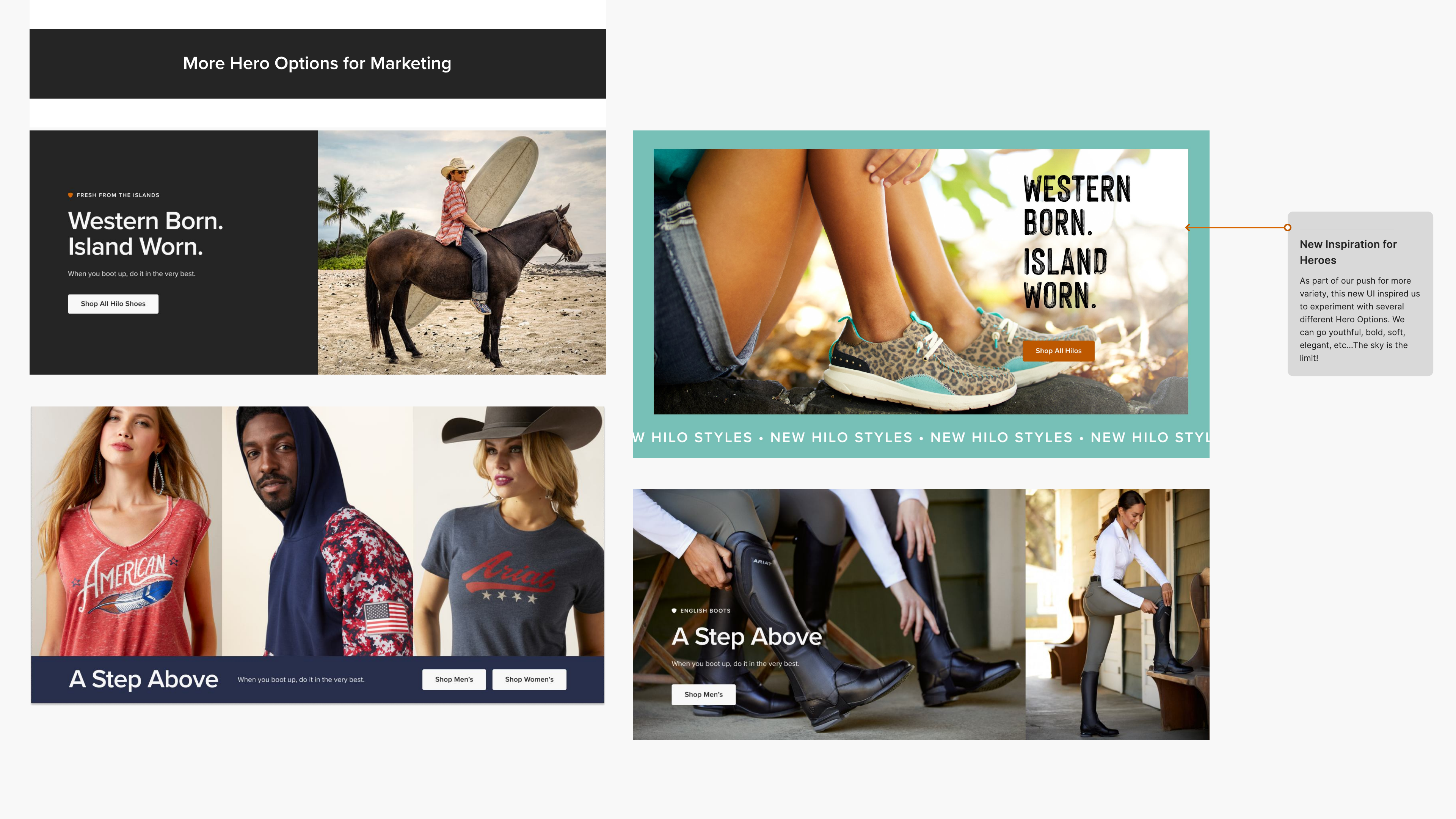
A SYSTEM WITH RANGE
The direction was designed to hold together across product launches, brand stories, seasonal campaigns, and different customer missions.
03 / EXPAND ACROSS THE ECOSYSTEM
One direction had to support every way into the brand.
The work reached far beyond one page. Ariat.com serves different audiences, shopping missions, merchandising strategies, and content needs. The experience had to stay coherent as those paths branched.
- 01
HOME
Brand and product discovery
- 02
NAV + SEARCH
Intent and wayfinding
- 03
CLP
Seasonal category stories
- 04
PLP
Product discovery systems
- 05
PDP
Confidence and decision support
- 06
BAG
Review and return paths
- 07
CHECKOUT
A clearer finish
Multiple templates, merchandising modules, category patterns, filters, and promotional systems
Stories that connect brand, product, and discovery
Responsive behavior / accessibility / research / experimentation / UX governance
04 / KEEP THE WORK ALIVE
The refresh became an ongoing product practice.
The 2023 release became a starting point. As Ariat grew, I kept bringing teams back to the customer journey, using workshops and live performance to decide what needed to change next.
- 012023
Establish the direction
I used the homepage to make the larger experience tangible. The proposal introduced a calmer type system, an 8-point spacing grid, larger touch targets, clearer calls to action, more flexible imagery, and a stronger treatment for Ariat Life.
- 022024
Extend the operating model
The work expanded into a shared way of planning Ariat.com. We clarified the purpose of each major touchpoint, aligned teams around the metrics that mattered, and made UX a more active partner in experimentation and in-season optimization.
- 032025 +
Keep learning and evolving
I led another homepage workshop and wireframe sprint when the page became crowded again. The new test cut its length nearly in half, increased content engagement, and gave the team better evidence for what to adjust next.
WORKING SESSION / 2025
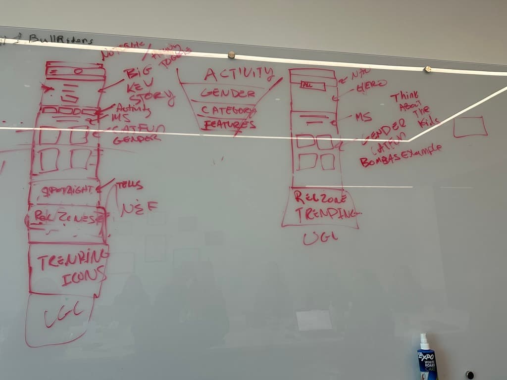
The next version started by getting the decisions out in the open.
I facilitated the workshop and translated the team's priorities into the wireframe that shaped the next homepage test.
05 / TEST THE NEXT VERSION
By 2025, the right move was to make the homepage do less.
The page had become crowded again. I led a cross-functional workshop and wireframe sprint to agree on a clearer content hierarchy before we designed the next test.
Fewer than 3% of visitors reached content below the old category funnel, giving us a clear reason to shorten the experience. We cut the homepage nearly in half, added stronger category entry points, and moved useful actions forward. The test produced a statistically significant lift in homepage content engagement.
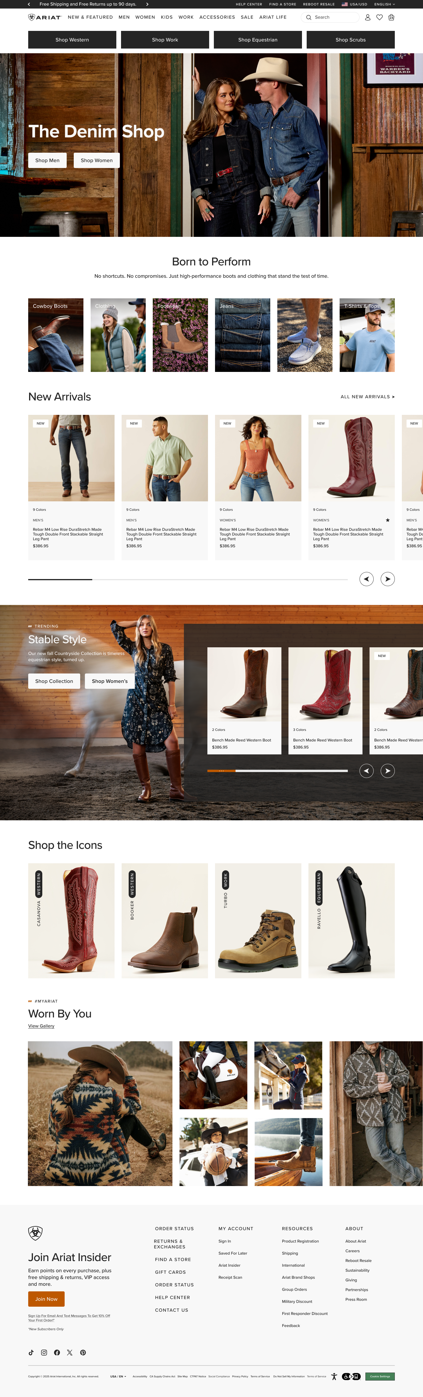
- 81%
- STAYED FIVE SECONDS OR LONGER, UP 3 POINTS FROM THE PREVIOUS HOMEPAGE
- ~½
- THE APPROXIMATE PAGE LENGTH IN THE TEST
06 / MY ROLE
I led the direction and stayed close enough to make it real.
I made the change believable
The original UI proposal gave marketing, eCommerce, brand, and creative executives enough detail to approve the direction and support a wider overhaul.
I connected the surfaces
I treated homepage, category storytelling, product discovery, purchase decisions, and checkout as one connected experience.
I led through the work
I set direction, facilitated workshops, coached designers, reviewed execution, and stayed hands-on when a prototype or design decision needed to make the idea real.
I kept the system responsive
The site kept changing after launch. I used research, experimentation, and new business needs to keep shaping the experience over time.
THE OUTCOME
The biggest win was earning permission to rethink the whole experience.
The initial refresh gave Ariat a clearer digital expression and gave UX more influence over the customer journey. That direction has since expanded into new category experiences, product discovery patterns, checkout improvements, Save for Later, bundles, and continued homepage experimentation.
I continue to govern the shared patterns and am preparing the design system for a headless migration. That work is in progress. This case study covers the customer-facing direction already established across Ariat.com.
VIEW THE FULL ARIAT PORTFOLIO