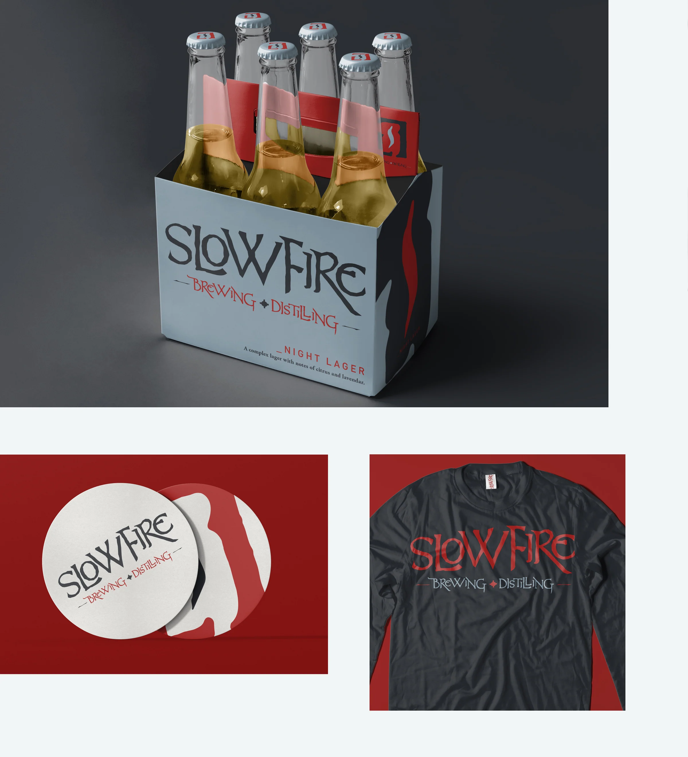
08 / SLOWFIRE
2015
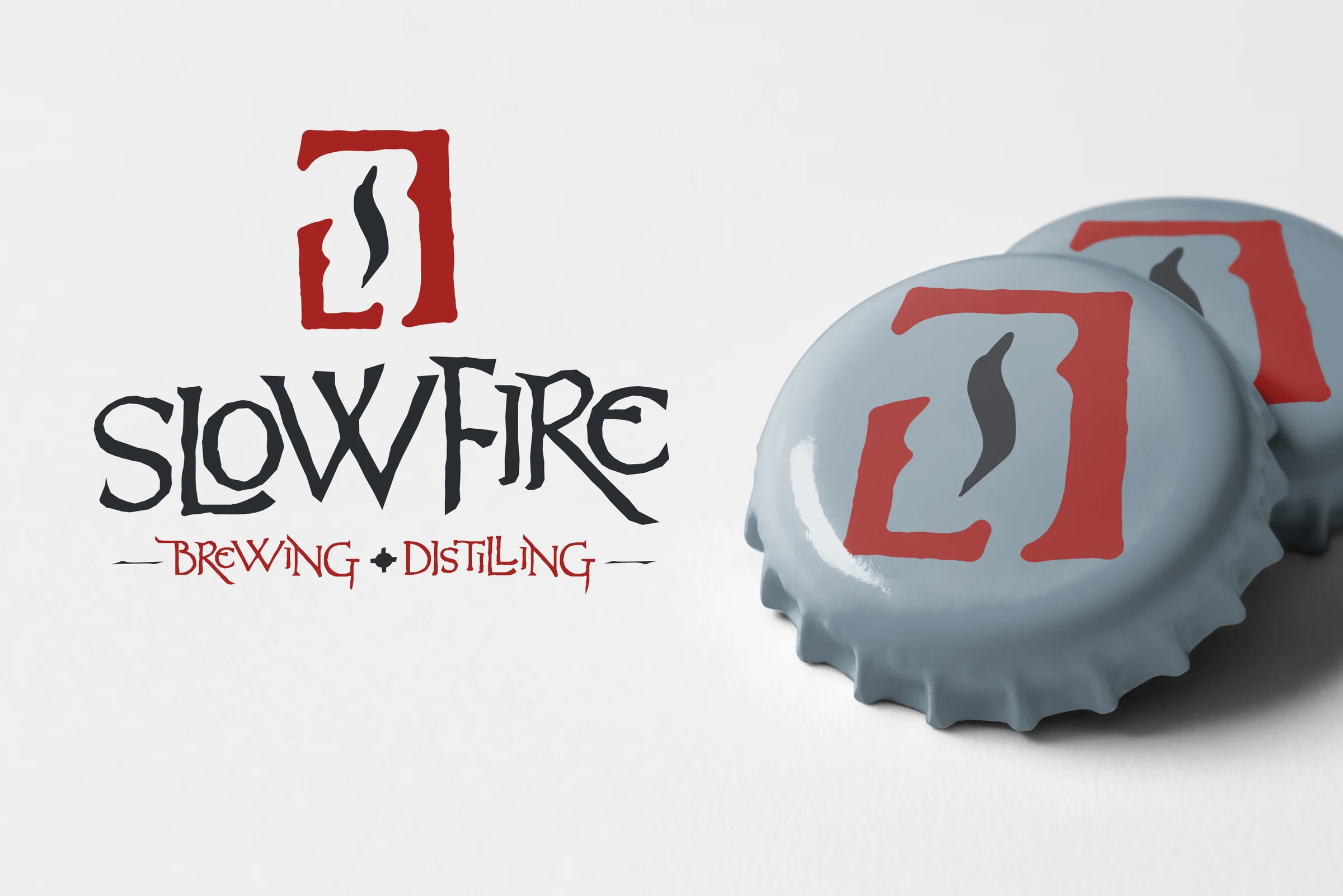
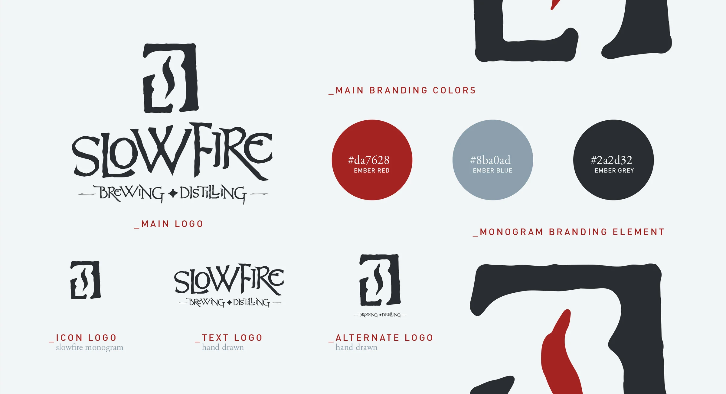
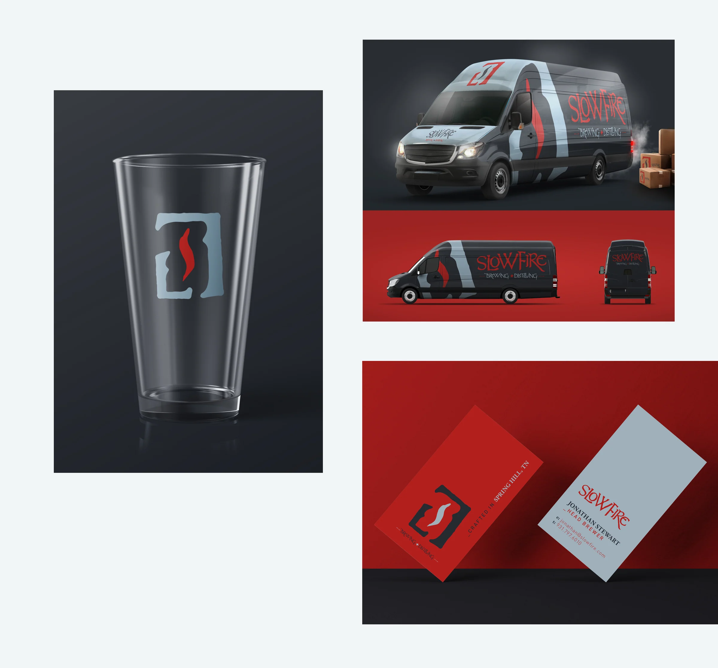
Designed an identity to work from bottle cap to building.
CLIENT
Slowfire Brewing + Distilling
ROLE
Brand + Identity Designer
SCOPE
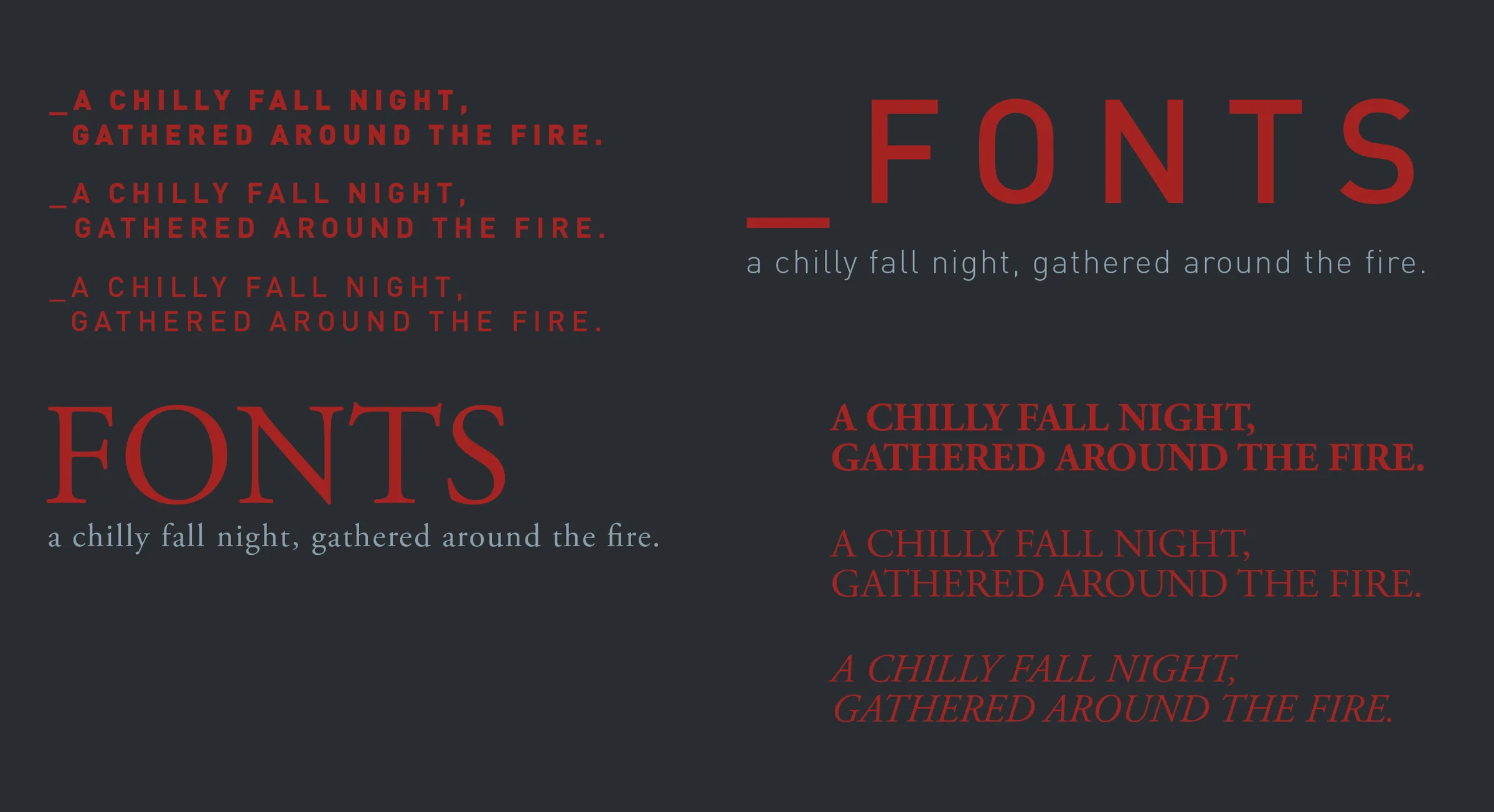
Brand identity / Modular mark / Visual system
THE ASSIGNMENT
The founders envisioned a brewery and distillery centered on quality, patience, and savoring life. They asked for a logo, but the real need was an ownable idea that could survive an eccentric category and an evolving business.
MY CONTRIBUTION
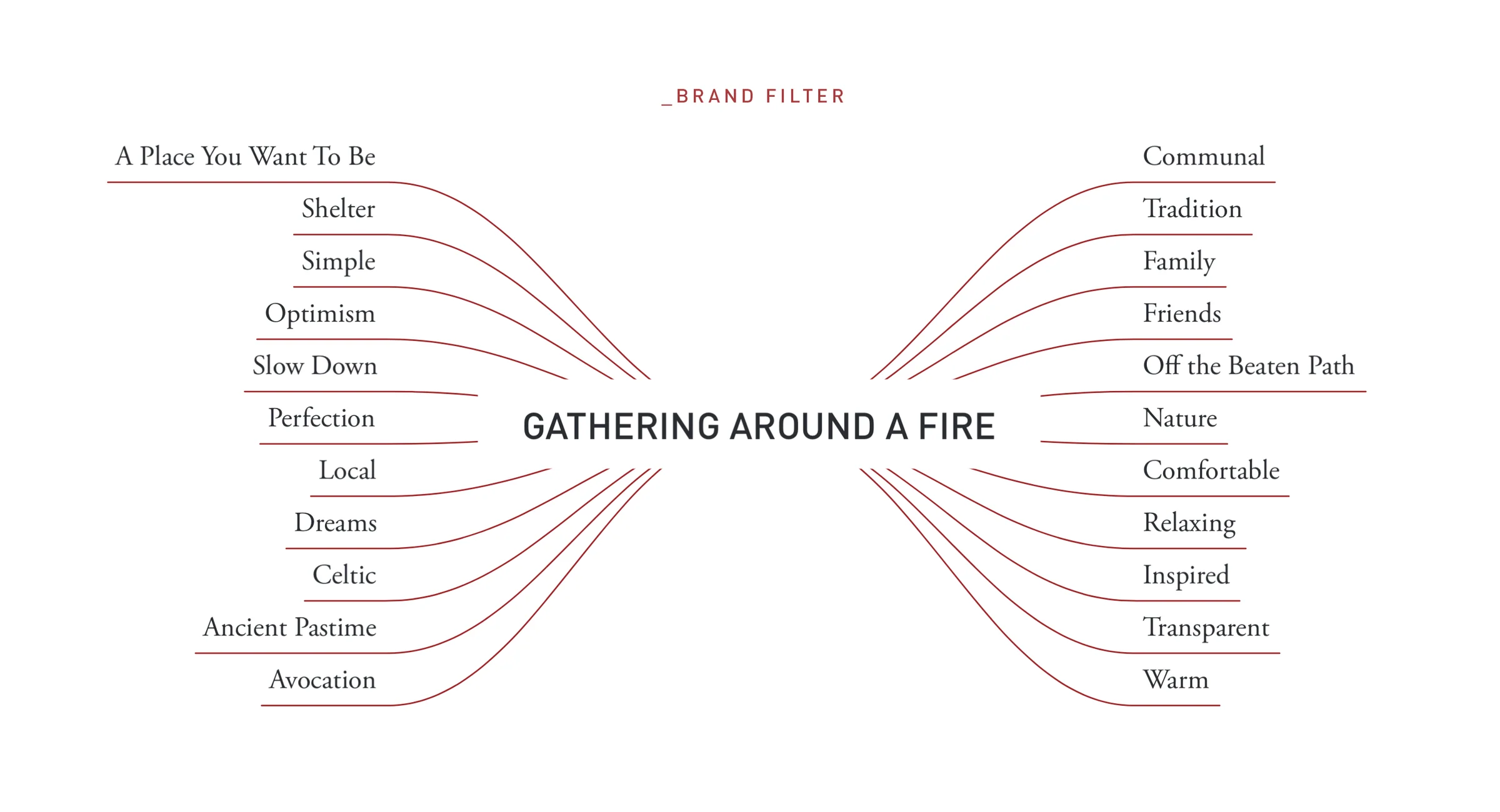
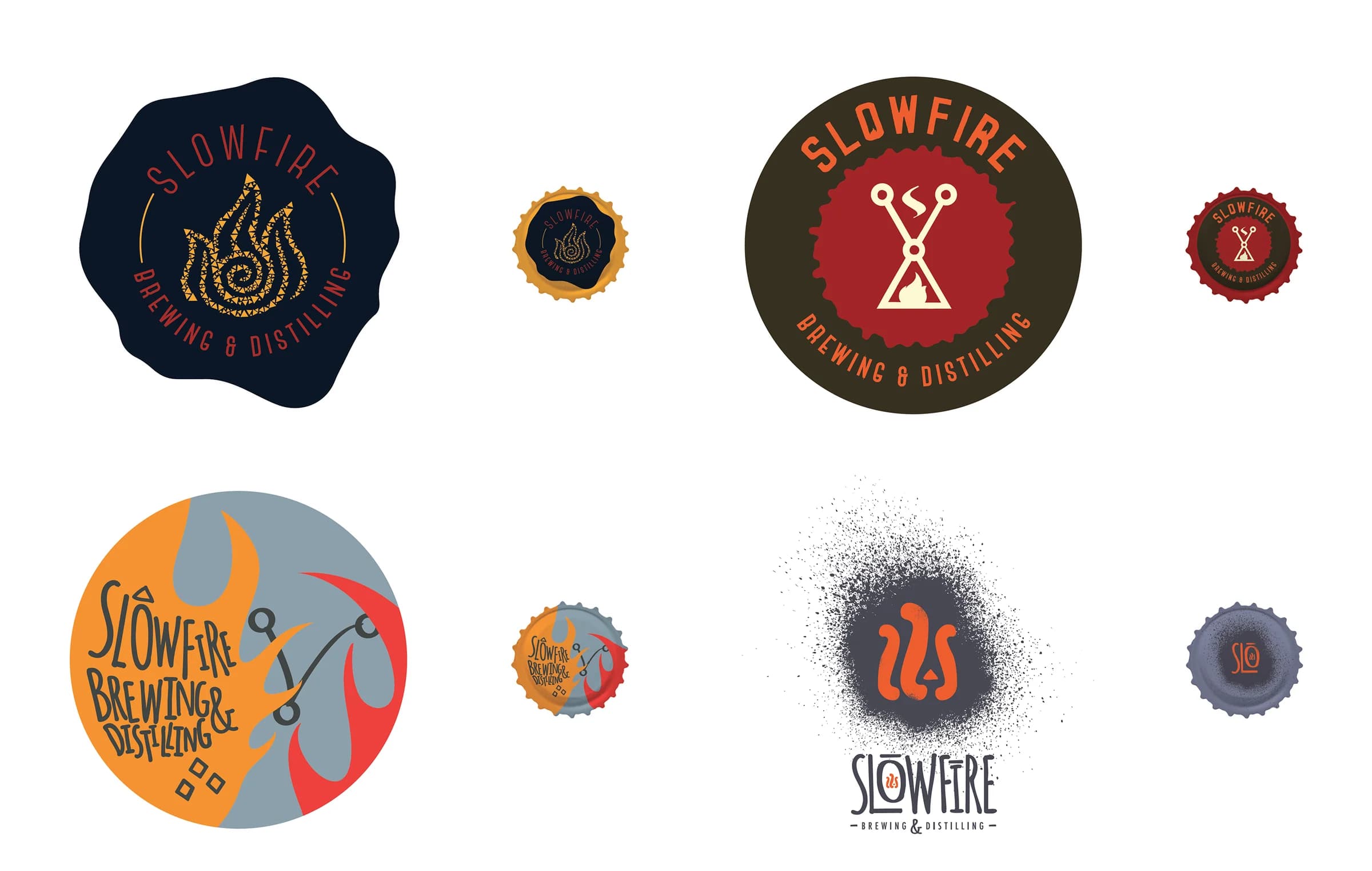
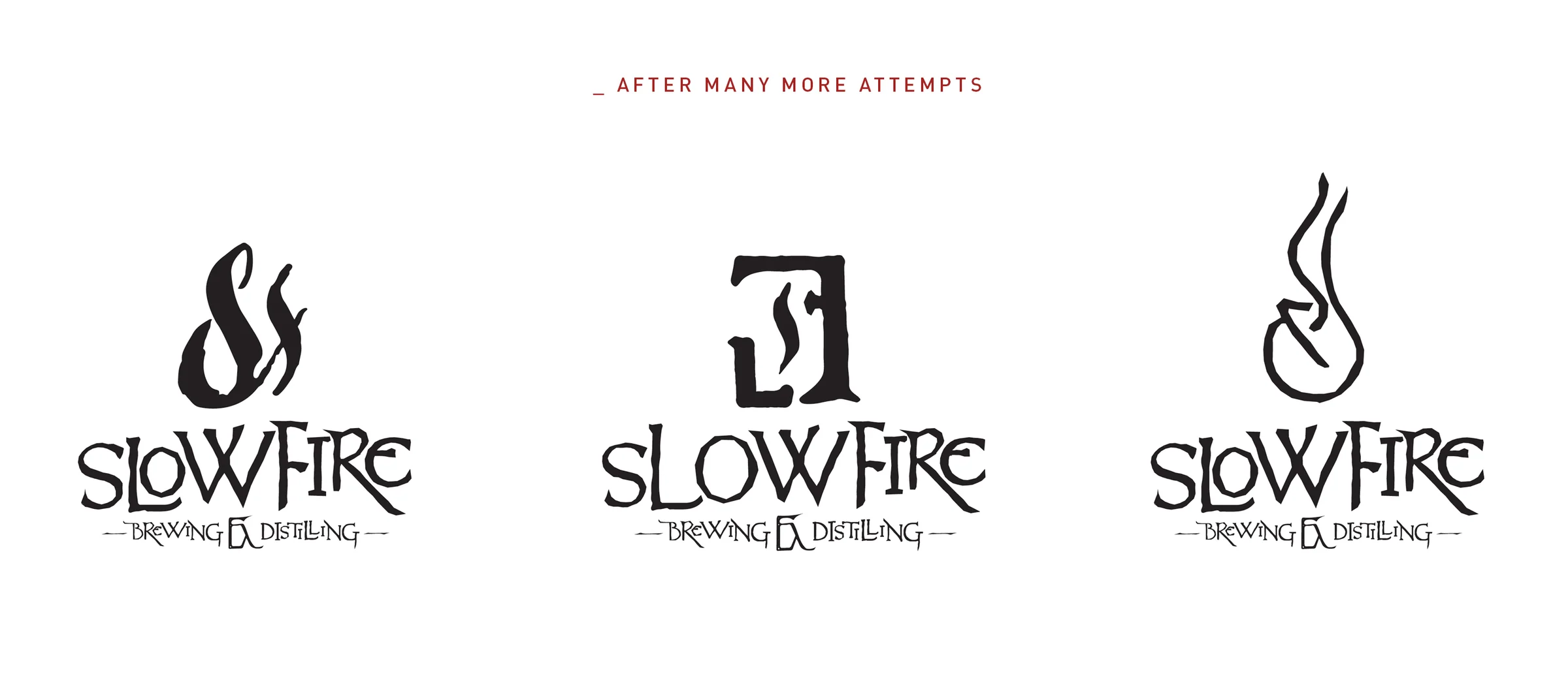
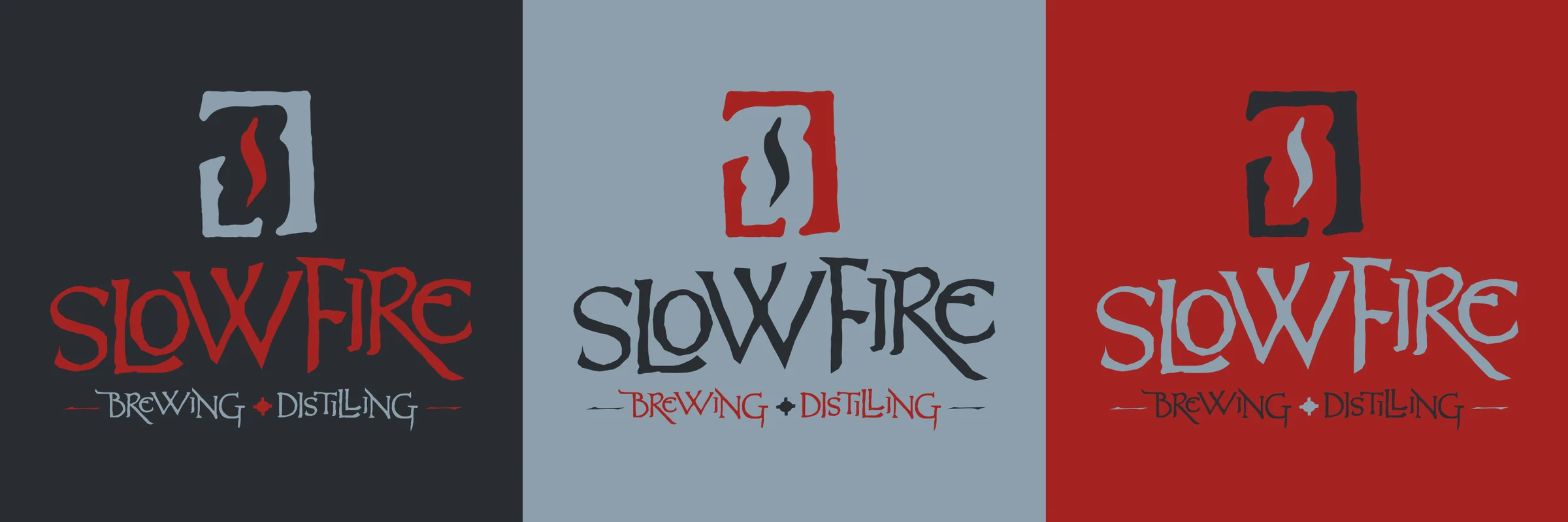
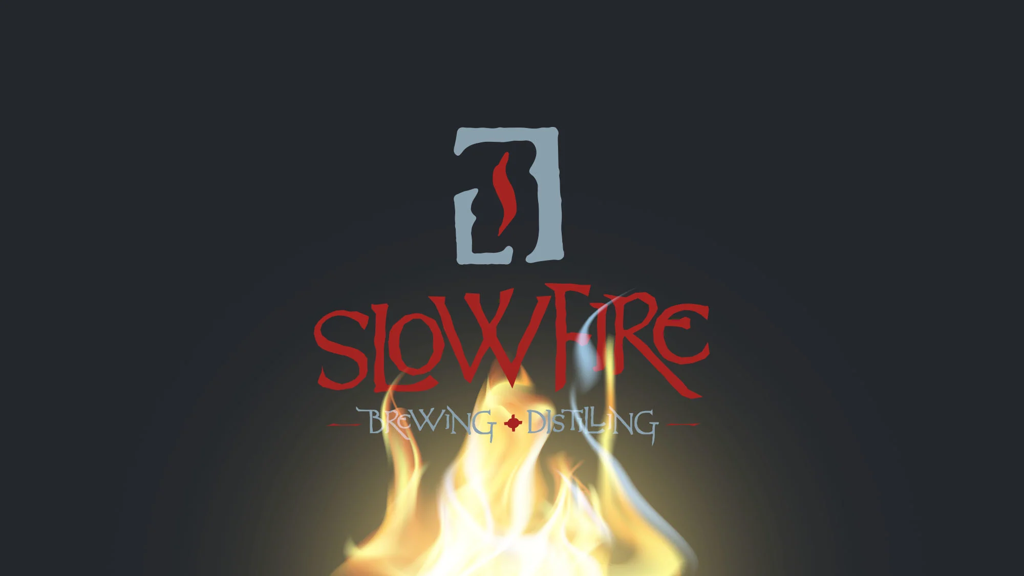
Discovery reduced the vision to “Gathering around a Fire.” I explored and refined many directions, created a modular relationship between icon and logotype, and repeatedly tested the mark from bottle-cap scale to large signage without stripping away its character.
WHAT IT ESTABLISHED
The identity held up from a bottle cap to a building. The process also taught me a lesson I still carry: simplicity usually takes more iteration, not less.